Step 4 - Suburb Selection
Data Metric
Stock on market %
Stock on Market is the number of unsold listings on market.
Stock On Market Percentage is the ratio of SoM to the total number of dwellings in the area.
Building approvals
Building Approvals is the number of new residential builds approved for construction (generally using datasets from the Statistical Area Level 2 level).
BA Ratio is the proportion of newly approved residential buildings over the past 12 months relative to total dwellings in the area.
Houses and units should be analyzed / reported separately.
Inventory
Inventory (also known as Months of Supply) is SoM divided by the average number of sales per month over a year.
It is used to define how absorbent the property market is of the new listings and measured in months.
Developable land supply
This refers to the amount of vacant and developable land that exists in and around a suburb.
Hold periods
Hold Period is calculated by comparing and averaging all properties’ sold dates to their previous sold dates.
“Tightly held” markets have higher Hold Periods, measured in years.
Source
Paid: all platforms I mentioned before
Free: HtAG (free version), SQM Research
Paid: HtAG, Suburbs Finder
Free: HtAG (free version), ABS website, Area Search
Note: for my free people, I'd just use HtAG for this - it will save you a lot of time. But Area Search can be good for looking at the building approval trends.
Paid: HtAG, Suburbs Finder
Free: HtAG (free version)
Free: Google maps, council planning websites
Target Range
Lower than 1.3%
Lower than 2%
Lower than 2 months
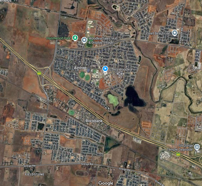
At least 5kms from any new greenfield estate / large area of vacant and developable land.
Ideally, we want to be buying in built up areas which are land-locked. Meaning there is no / limited vacant land to build more houses.
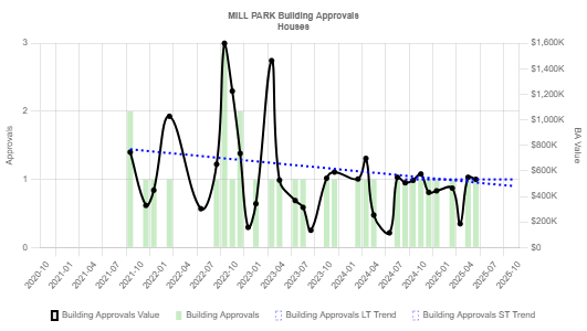
Example below (Mill Park):
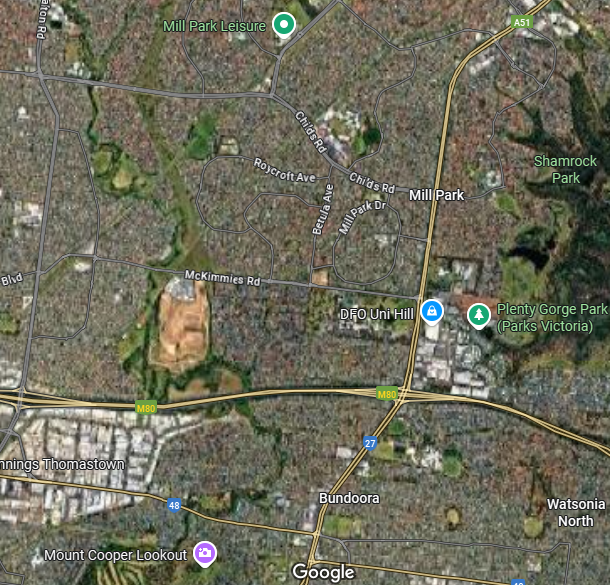
We want to be avoiding areas with lots of vacant areas to build houses on.
Example below (Rockbank):
Trend Analysis and Guidance
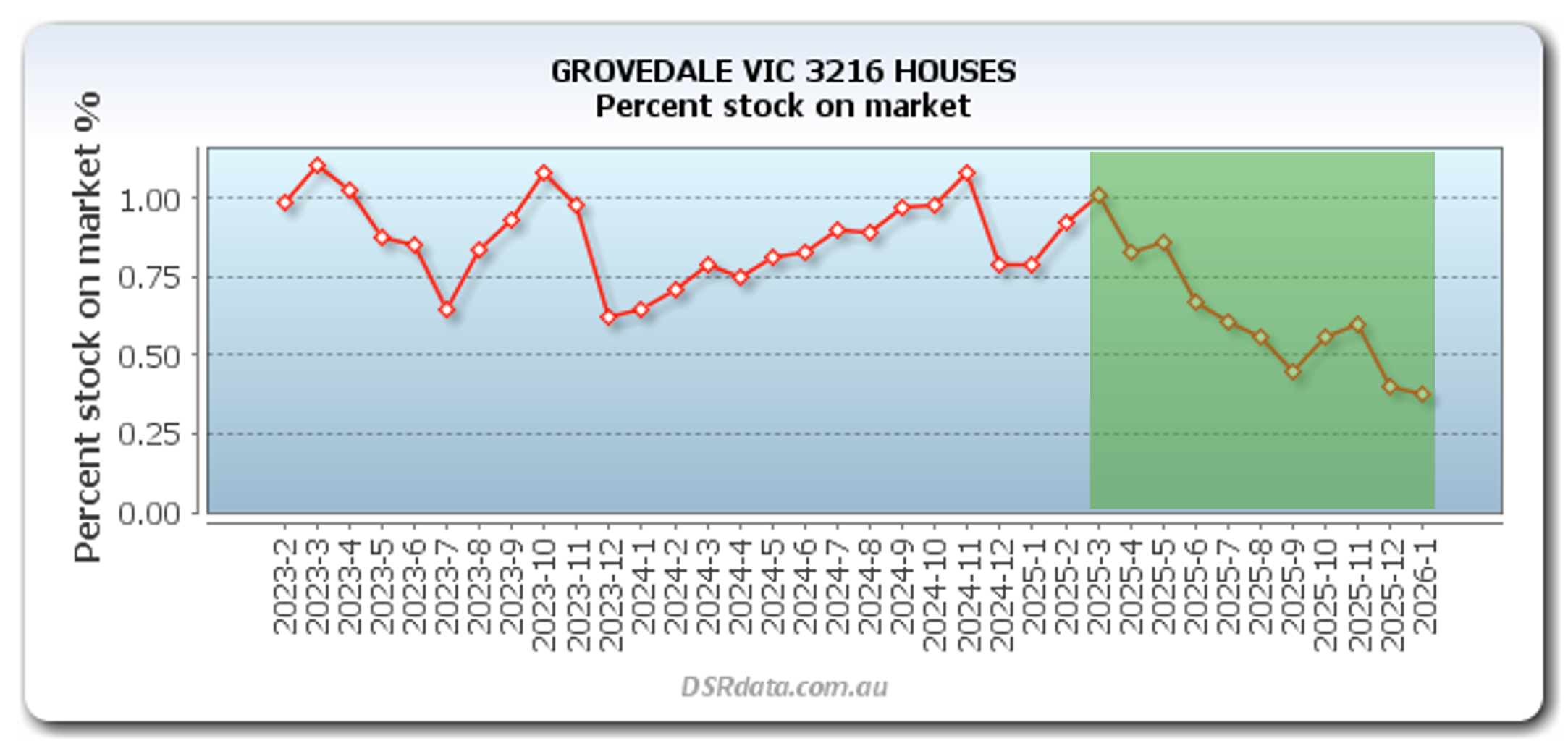
Downwards trend over at least the past 3 months.
The below graph is a perfect example of a great trend line.
Here is another good example, where the trend line shows a clear decrease over a few months to a point where it is within the target range then has stablised well below the target range.
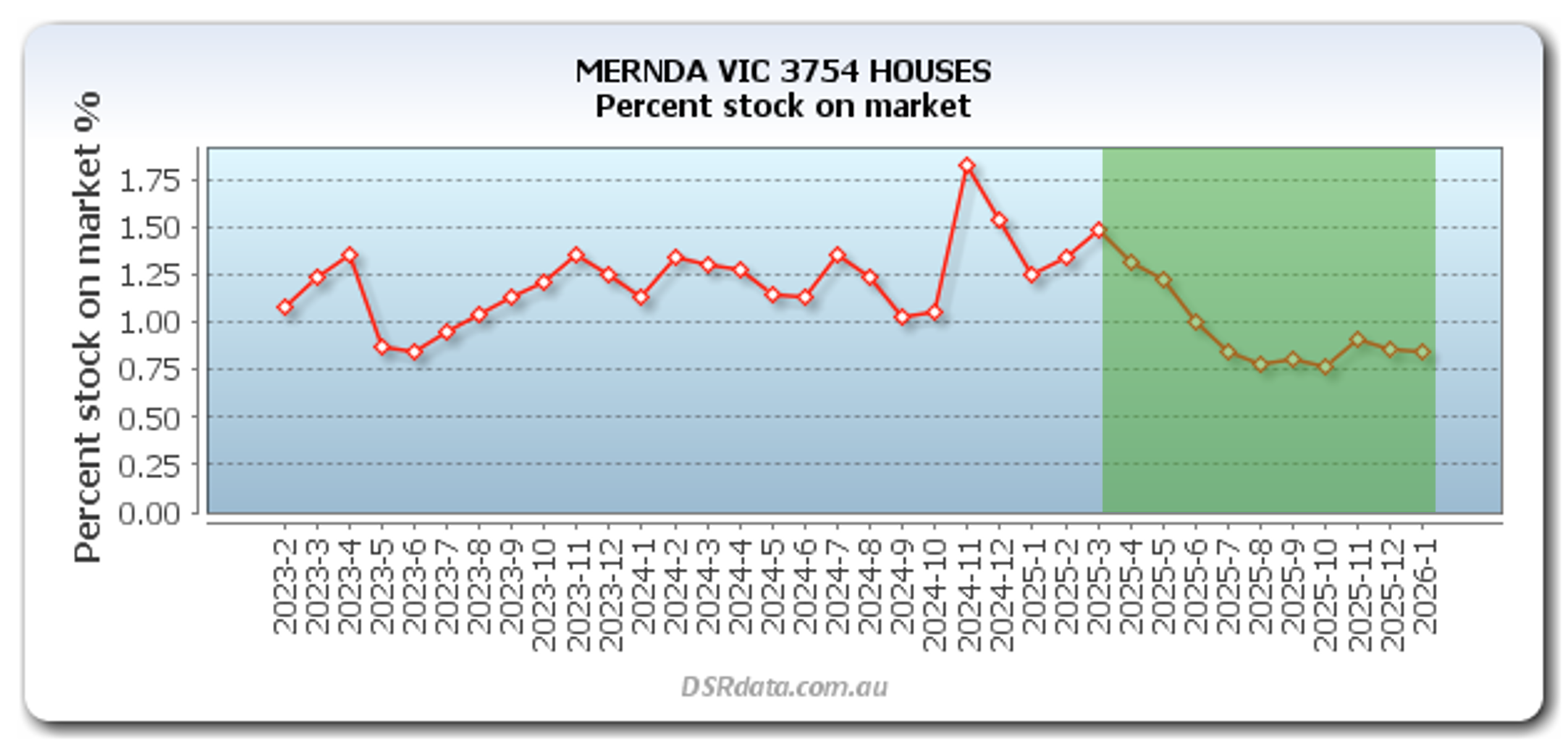
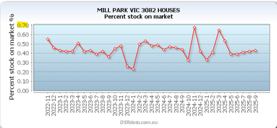
Sometimes, you may see a trend line that is flat for a long time or even very sporadic (i.e. going up and down a lot), this is ok if the actual stock of market percent is very low and has remained within the target range that whole time.
For example, if you look at the below graph it would appear that the trend line is all over the place which would not be a promising sign; however, you can see that the actual stock on market percentage has never even reached above 0.70 which is chronically low (i.e. this is a a good thing).
Just to make things crystal clear because this is a concept that carries on throughout other metrics, let me show you examples of bad suburbs and trend lines.
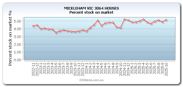
See the below from Mickleham, you can see that the trend line is moving upwards over time and the stock of market percent is over 5% which is very bad.
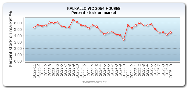
This is an interesting example, you can see the below trend line is actually moving downwards consistently over the past few months; however despite this, the stock on market percentage is still so high (i.e. over 4% in this example) that you would still immediately ignore this suburb.
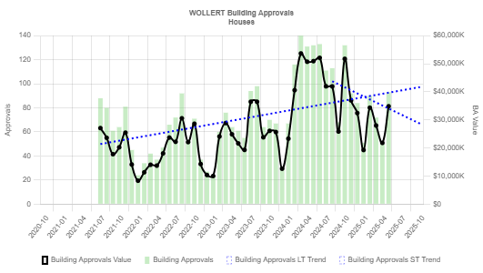
Downward trend and/or consistently low building approvals over recent years.
The trend line below is a good example. The suburb had a few approvals a few years ago (but still not a lot…), but over recent years it has had a clear decrease in approvals and they are now sitting at nearly zero which is critically low.
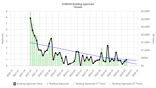
That is an example of a downward trend, another a good trend is just when the trend line is relatively flat and at a level that is really low (i.e. there have been barely any approvals for years).
See the below for example and also remember to always look at the 'Approvals' axis which shows you the number of approvals.
Just for reference, here is a bad example - avoid these suburbs at all cost. The building approvals ratio in this suburb is 8% (i.e. over 1000 approvals) based on HtAG.
However, some other areas may have a lot of vacant land around them but they are not zoned for houses to be built. For example, they may be parkland, wetlands, farmlands or just areas the council wishes to preserve for the integrity of the area.
Doreen is a good example of this, take a look at the Google maps image below and you will see there is heaps of vacant land to the right hand side of the suburb which might make some investors immediately discount it.
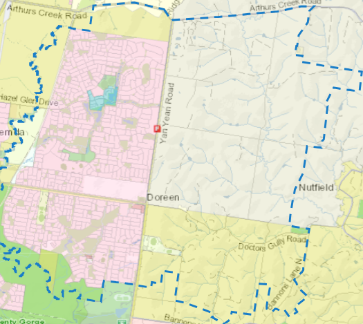
It is also important to call the local council to confirm that they don't plan on doing any large scale rezoning any time soon. They are usually very nice about this if you are also nice with them - just be honest with them and tell them you are an investor and are curious about their future plans.
Flexibility
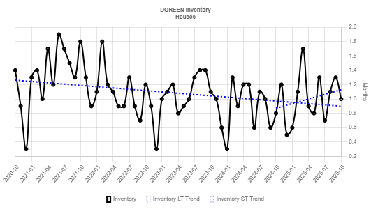
The below is a good example of a positive inventory trend line, it has been decreasing over the long-term and has remained at a very low level (0.8 months) over the past few months.
Downward trend and/or consistently low inventory for at least the past 3 months.
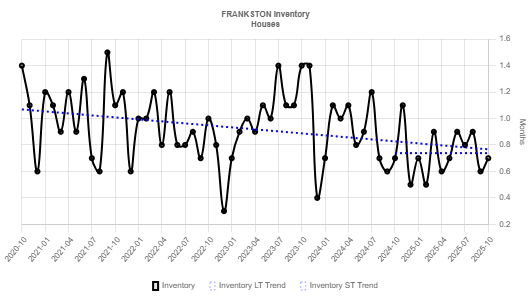
You will see, especially if you are using HtAG, that the inventory lines can look erratic - i.e. they are quite up and down.
For this reason it is important that you look at the long-term trend line as well as the 'Months' axis to make sure that even if there is a small increase in inventory over recent months as long as it is in the target range still then that is ok.
See the below trend line as an example.
Trend analysis is not applicable here; however, I do have some important guidance for you to keep in mind when assessing ‘developable land’.
Just because a suburb has lots of vacant area around it doesn't mean that it is developable or going to be developed.
One major thing to consider here is the zoning of an area. If you go to the local council website of the relevant suburb you are looking at you will be able to see if the vacant land in the surrounding areas is zoned for houses to be built. If so, then this is bad as it means developers can build on the land - and if they haven’t yet, they will eventually.
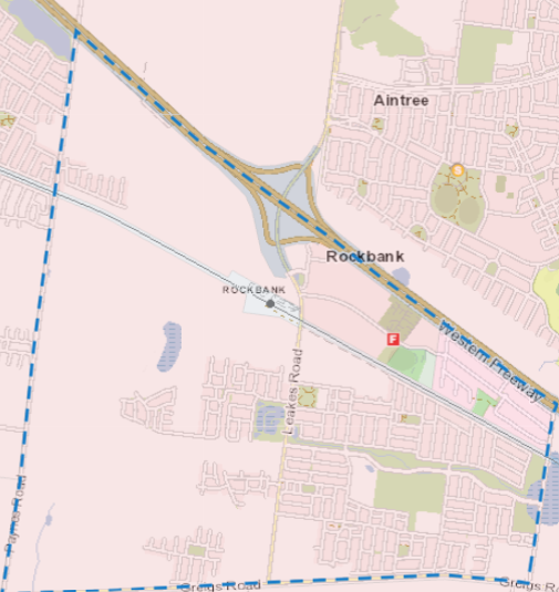
Below is an example of the zoning in Rockbank. Based on the legend that the Victorian government provides on ‘Vic Plan’, all of the vacant 'red / pink' land is an 'Urban Growth Zone' where they are promoting urban development of more houses (all councils / states should have a legend and similiar website that you can use, or you can just call and ask).
This means all this vacant land is able to have houses built on them right now and is therefore a no-go suburb. It is also a good idea to cross check this with the building approval ratio, as often areas like this have a high-building approval ratio.
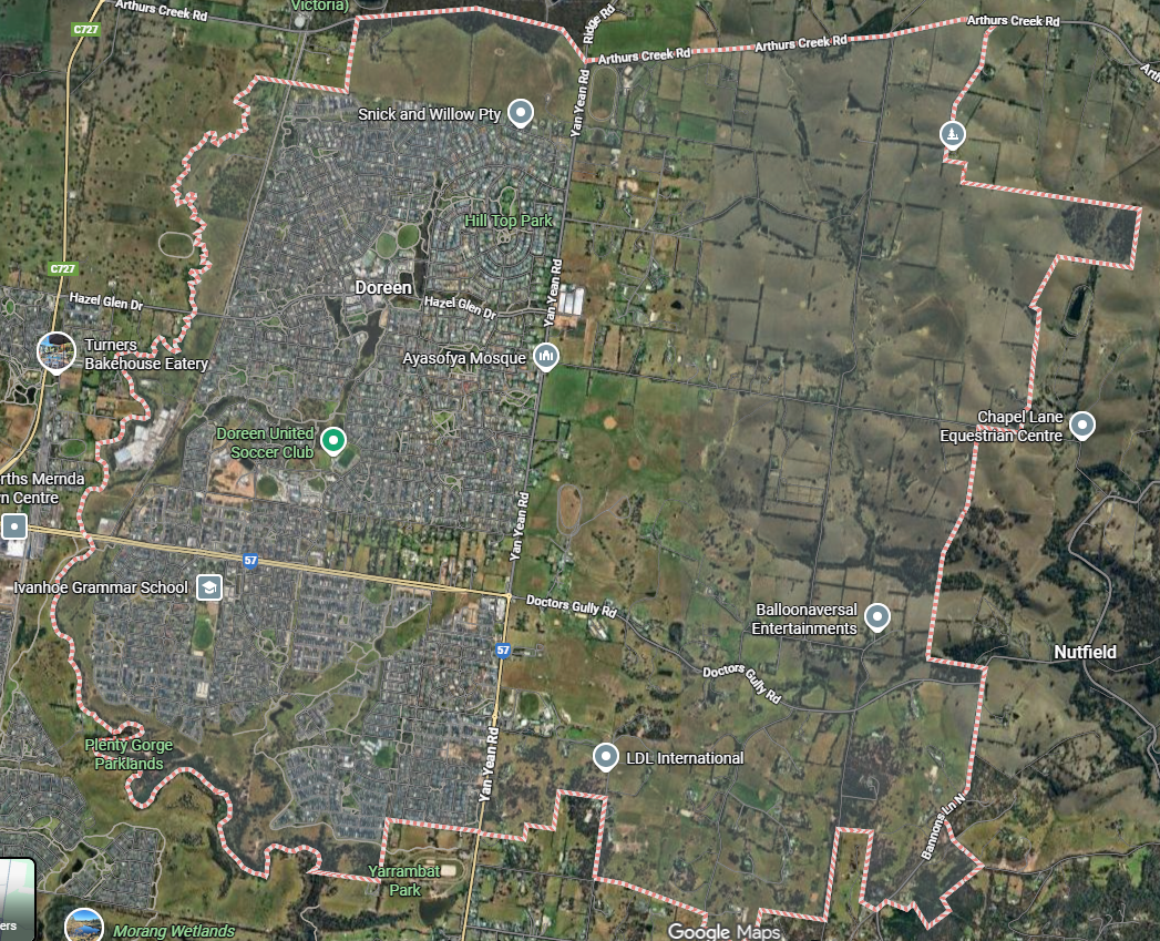
But if you actually look at the zoning of the land (see below) you will see that this land is zoned as either a 'Green Wedge Zone' or 'Rural Conservation Zone' meaning that residential homes cannot be built on them.
Low
If the trend line is very positive (in the sense it is going downwards obviously / dramatically and over a sustained period of time) you may flex this to anything under 1.8, but I wouldn't be going over this.
Low
This is one of those data points I do not comprise on, you can maybe go to 3% if everything else looks great and building approvals are trending down, but personally I don't flex this metric.
Low
Again, as you will see from the above, I generally don't like to be too flexible on the supply side metrics as they are entirely out of your control.
Low
Again, as I have said above, supply is the enemy of capital growth so I am not very flexible on this - but you don’t need to be as strict as discounting a suburb because it is 4km away from a lot of developable land as opposed 5km for example - especially if everything else looks positive.
Rationale
When the stock on market is high, that means supply outweighs demand which as we know results in prices stagnating or decreasing.
Therefore, we want stock on market to be very low and trending in a downwards direction which suggests it is going to stay very low into the near future.
As we know, supply is the enemy of capital growth. This means that if there are a lot of building approvals in an area then this will put downward pressure on house prices as more supply will enter the market.
If building approvals are low, then that means supply will likely remain low and prices will increase if there is sufficient demand.
Similar rationale as for building approvals and stock on market, the lower the inventory then the less supply there is in an area which means more upward pressure on prices.
Please refer to Step 1 where we discussed 'Land Availability' in the Demand vs Supply section.
But in summary, if there is a lot of available land in an area then that may enable future developments which will increase supply and put downwards pressure on price growth.
Paid: HtAG
Free: HtAG (free version)
Greater than or equal to 7 seven years.
Increasing upwards over the long-term.
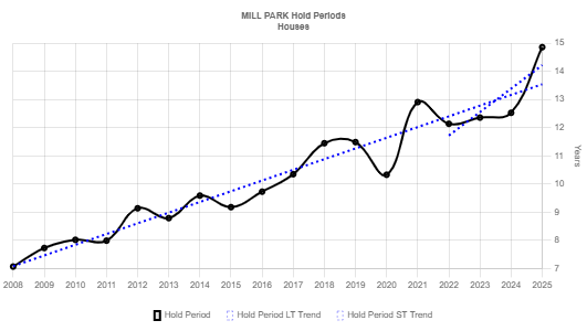
An example of a positive long-term hold period trend is below.
Remember that in most suburbs there may be some decline periods over the short-term but this is acceptable if the long-term trend is good.
The below is an example of a bad hold period trend.
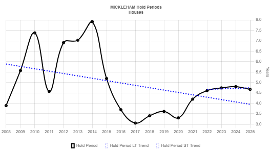
Medium / High
There is quite a lot of flexibility with this data factor as there is some debate in the property investing communities about whether there is technically any relationship between hold periods and capital growth.
However, it can be a useful data factor to trigger you to look deeper into a suburb, because if residents aren't living in an area for at least 7 years it could mean there are other issues with the area that you may have missed (i.e. it’s a new house and land estate, or it’s a very renter dominated area).
With all that being said, this is a data factor you should definitely consider but it does not weigh as highly as something such as stock on market or building approval ratio. Or in other words, if all things are equal - sure invest in the suburb with the higher hold period, but if a suburb has a lower hold period but the other supply side metrics are looking better then choose that one.
The higher the hold period then this can reflect the desirability of the area and also mean that less supply will be available in the future as people don't tend to sell their homes.