Step 4 - Suburb Selection
I know what you are thinking: finally - the juicy stuff, where should you invest.
This section will not tell you where to invest. It will show you a methodology and the key data factors you should be looking at so you can identify where to invest whenever you want.
But before we get into this, we need to do a bit of a mindset reset - unless this is the first time you have ever heard of property investing before there is a good chance you have a lot of preconceived opinions on what makes a good suburb. However, as I have said before, most people in Australia have no idea what actually makes an investment-grade suburb.
So I need you to come into this section of the website with an open mind, and to assist with this I thought it may be useful to start with some good old fashioned myth-busting. Many investors waste time looking at factors that have no impact on capital growth / price increases in a suburb.
Some of these myths may be difficult to believe because you may have heard your favourite property guru suggest they are not myths or they may even just make logical sense; however, there is no actual evidence suggesting they have a positive impact on property prices in areas.
One thing to note, a lot of the below graphs come from Jeremy Sheppard - the founder of the DSR research tool. He has a new series going on his YouTube channel 'Suburb Data' called the 'Expert Busting Series' which I have linked a few times below - definitely follow this series as he releases more episodes, it's very good.
Statement
Capital cities always outperform regional markets
Expensive 'blue-chip' areas / properties perform better than cheap ones
Invest in areas with the highest incomes and income growth because that means the people living there can afford to spend more on property
You need to buy a property as close to the CBD as possible
You need to buy a property near train stations, shops, good schools etc. because those properties grow more
Invest in markets with a proven track-record of high growth / performance

Myth or Fact?
Answer:
This is a MYTH. There are periods in time where regional cities outperform capital cities, and there are other times where capital cities perform better, but in the long-term they generally perform similarly.
Explanation:
The data shows us that capital cities do not always outperform regional cities, rather it shows that over the long-term they generally perform quite similarly. Don’t believe me? Check out the below graph which compares the cumulative growth % of Australia's capital cities and major regional markets.
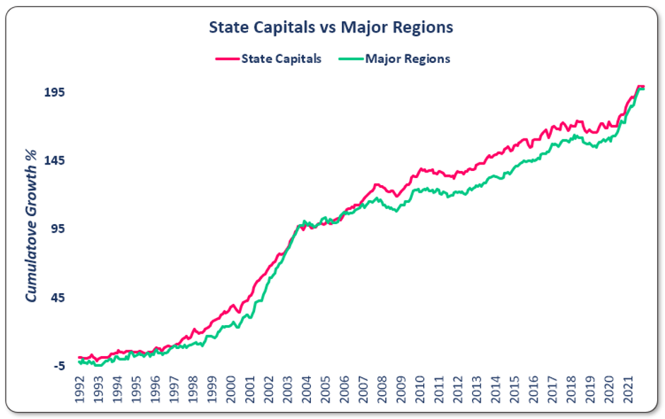
As you can see from these two graphs, the main point for you to note here is that there are certain points in time where regional markets outperform capital cities, and there are other times where capital cities perform better - but in the long-term they perform similarly.
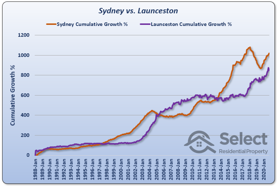
Let's test this theory by looking at the performance of one regional market, Launceston in Tasmania, and one capital city, Sydney in New South Wales. As you can see from the below graph, there are certain periods of time where Launceston (the purple line) performed better than Sydney (the orange line) and vice versa, but over time the two lines continue to converge on each other (i.e. they continue to meet each other / overlap at certain points).
You can get quality and quantity in property investing - they are not mutually exclusive. In fact, for a lot of people, including the average Australian, it may make a lot more sense to buy multiple affordable properties instead of one or two expensive properties. I won't get into the details too much on this argument as it deserves a section of its own, but take a look at the below videos which I think cover what you need to consider to make the best decision for your personal circumstances.
"Oh but that graph just includes the major regional markets - what about the smaller areas?"
That’s a good question and the answer is the same. Check out the below graph which compares Australia's ten largest significant urban areas and ten smallest significant urban areas (sorry this one is a bit blurry).
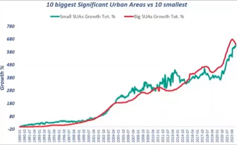
They key takeaways of all these charts is two-fold:
Do not limit yourself to only investing in capital cities - when it makes sense you should also be happy to invest in certain regional markets; and
If you time your entry into certain regional markets you can outperform capital cities over certain periods of time (and vice versa…).
If you don’t believe me (or the data I have presented) there are plenty of other resources and videos that you can look at to verify my comments - check them out below.
One thing to note, this doesn’t mean you can just buy in any regional market and expect to see the same growth as a capital city - there are other factors to consider such as economic diversification and price volatility - but this section is just to educate you that you shouldn’t just be discounting regional areas purely because they are regional.
Answer:
This is a MYTH. Affordable (i.e. cheaper) properties generally perform better than expensive / blue-chip suburbs.
Explanation:
Plenty of property gurus out there in your Instagram reels and Facebook feeds will tell you that you need to target those blue-chip areas as they are the most desirable - which is good advice if you are investing to impress your mates but horrible advice if you are trying to make maximise your return on investment, because the data shows us that the affordable areas in Australia generally experience better capital growth than the expensive suburbs.
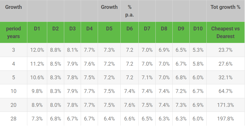
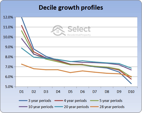
The below table shows the growth rate of properties in Australia ranging from extremely cheap (‘D1’ column) all the way up to extremely expensive (‘D10’ column) over a range of different time periods. As you can see, those cheapest properties consistently outperform the more expensive properties - with the biggest difference in price growth being evident in the short-term, then over the long-term the gap closes quite a bit, but the cheaper properties still outperform in any event…
One further concern I often hear from novice investors is that they think the cheaper markets are more volatile and so they think these blue-chip areas are more of a "safe-bet" because there is less risk that they will decrease in value as much as cheaper areas. However, this is also just wrong.
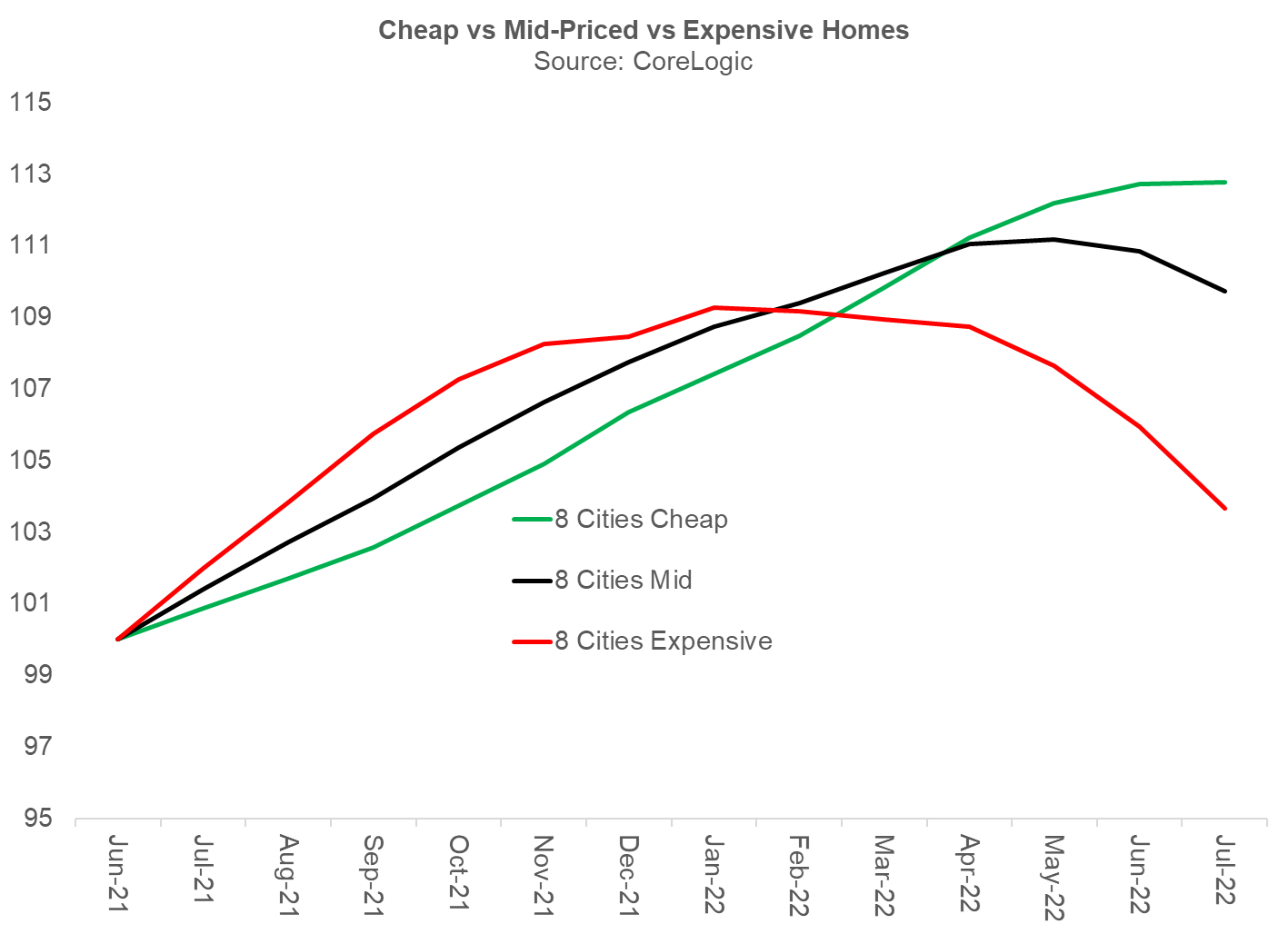
Take a look at the below graph from Cotality which shows that whilst the more expensive properties (in red) can sometimes increase in value a lot quicker than cheaper properties (in green) - especially in 'booming' markets, they also decrease in value a lot quicker than cheaper properties. This means that expensive properties are generally more volatile than cheaper properties and it is actually the cheap markets which are more of the consistent performers.
So what is the takeaway here? Should you just be buying the cheapest properties you can find? Absolutely not. I think I need to really emphasise this - ABSOLUTELY NOT. The point here is just to show you that a higher price doesn't equal higher growth and that it is entirely possible to focus on the more affordable properties and still get great results - you don’t need to buy blue-chip and in-fact unless you are a very very high income earner you probably shouldn’t...
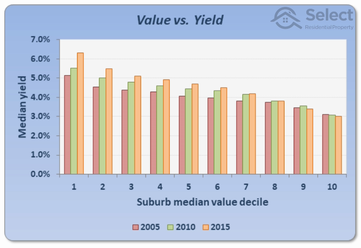
This is important to remember because as we have discussed previously, if you ignore the above and are still desperate to get into these blue-chip / premium areas you may be sacrificing on the quality of your asset (i.e. a unit in a large complex), or using all of your borrowing capacity on a very low-yielding asset as the data also shows that the more expensive the property, the lower the yield tends to be (see the graph below for example), which will stunt your ability to build a sizeable property portfolio.
Answer:
This is a MYTH. There is no evidence to suggest that suburbs with higher incomes or high income-growth perform better than other lower-income suburbs.
Explanation:
I know it's hard to believe that this is a myth, because it sounds so logical - if people earn more money in an area then surely those areas will grow quicker because people will have more money to spend on property? Right? Nope - that is wrong, the data just does not support this conclusion.
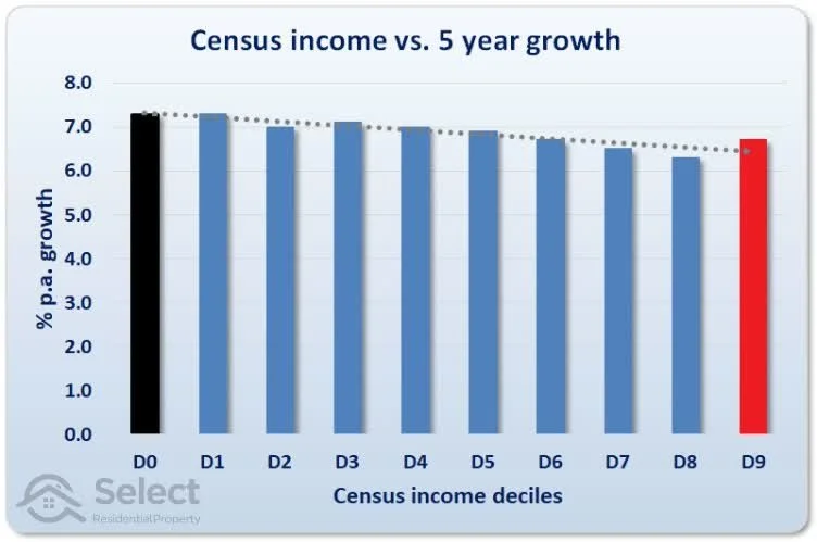
In fact, over a 5-year and 10-year period the opposite appears to be true. This is clear from the below graphs which tracks the annual growth rate across those suburbs with the lowest income (D0) up to the highest income suburbs in Australia (D9), in which you can see that those suburbs with a lower income (based on census data) have performed better than those higher income areas.
What do the results look like beyond a 10-year horizon? Great question.
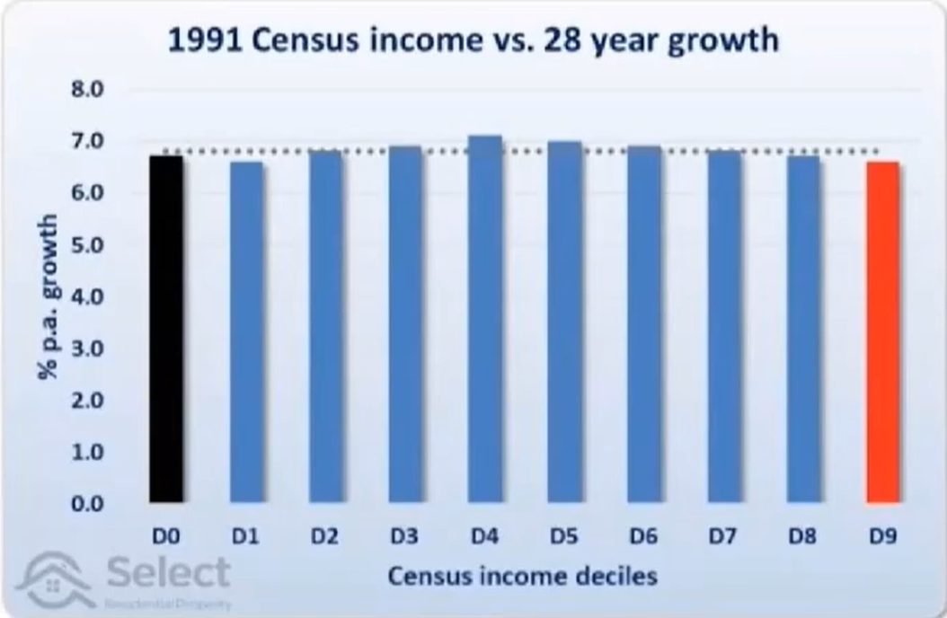
The below graph gives you the answer, in which it shows that over a 28-year period the income of an area does not have a significant impact on annual growth rates; however, it appears that those middle income suburbs (D3 - D5) appear to perform the best and the highest income areas (D9) are actually the worst.
Again, just to reiterate, this doesn't mean you should just go buy as far away from the CBD as you want and then expect to experience capital growth - all the graphs above tell you is that distance to the CBD is not very important and you should focus on other data factors when choosing an investment location.
Feel free to check out the below video from Suburb Data for more information on this topic.
This means that there is no period of growth or decline / stagnation in property prices that lasts forever and therefore it can be said that "past performance is no guarantee of future performance".
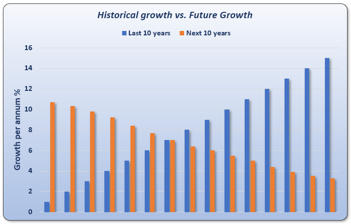
For example, just because one area has outperformed the Australian average and grown 10% per annum over the past decade it does not mean it will replicate this growth over the next decade and the decade after that. In fact, the data indicates that it is more likely that the opposite will occur and it will then underperform in the future - the below graph which looks at data from thousands of suburbs across Australia over the past 30 years demonstrates this perfectly.
So if we take the furthest left dataset on the graph we can see that suburbs which performed the worst in the last 10 years with an average growth rate of approx. 1% (in blue) then achieved the highest growth rate in the next 10 years with an average growth rate of approx. 11% (in orange) - and if you go to the far right hand side of the graph, you can see the opposite occured…
A similar pattern occurs when looking at a slightly longer period of 14 years, which emphasises the point that areas with a high-historical growth rate are actually a red flag.
For those who are more visual learners please also take a look at the below graph which maps out the data in the above table.
Again just to reinforce the point, as you can see the cheaper properties generally perform better than the expensive properties, especially in the short-term; however, this growth-rate difference does minimise over the long-term (as it does with almost all property markets in Australia…).
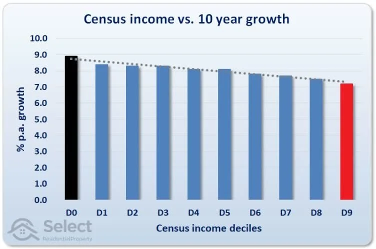
Similar results are achieved when you look at income growth in an area as opposed to just the current income levels - the rate of growth of incomes in a suburb does not have a positive relationship with capital growth.
In fact, if you look at the graph below it actually suggests that the lower income growth areas performed better than those areas with higher income growth.
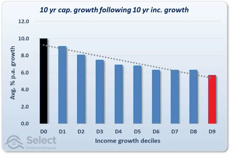
Again, the takeaway here is not to tell you to go and invest in the lowest income area you can find - it is simply to let you know income analysis is a poor predictor of capital growth and therefore should not be a core focus of your research when selecting an area to invest in.
Feel free to check out the below video from Suburb Data for more information on this topic.
Answer:
This is a MYTH. There is no statistically significant relationship between capital growth and proximity to the CBD. There are more important factors to be considering when making an investment decision.
Explanation:
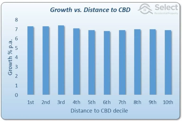
The below graph categorises those suburbs in Australia's capital cities (excluding Darwin) into distance to their respective CBDs, with '1st' being the closest and '10th' being the furthest away, then measurers their respective capital growth rates over a 20-year period.
As you can see, there is no statistically significant pattern that can be ascertained. For example, you can see that the '3rd' closest suburbs perform better than the '1st' but then the '10th' closest performed than the '6th'. If this myth was to be true, we would see a clear pattern whereby '1st' would be the best performing, then '2nd' would be the next best and so on until we get to '10th' which should be the worst performer.
So what do we learn from this graph? Should you focus on those suburbs which are the '3rd' closest to the CBD because the graphs says they grow the most, or avoid those that are the '6th' closest to the CBD?
No…. the main takeaway from this graph is that distance to CBD is not very important and there are far more influential data factors that you should be analysing when deciding on an area to invest in.
"But that doesn't make sense, the houses closer to the CBD are way more expensive…" That is true, but it is important to remember we are discussing growth rate here rather than just price, because that is how we measure performance as a residential property investor.
The reality is that those suburbs closer to the city have always been more expensive, ever since the land was allowed to be purchased and built on, and they will continue to be the most expensive because they continue to experience the same / similiar amount of growth over the long-term than the outer ring suburbs.
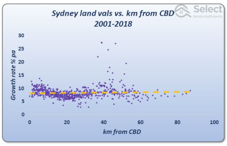
The below graph shows this well as it compares the growth in land values in Sydney based on their distance to the CBD and you can see from the trend line (in yellow) it doesn't matter how close or far away you are from the CBD, over the long term they generally experience the same amount of growth.
Answer:
This is a MYTH, properties closer to amenities do not perform better than those which are further away.
Explanation:
I have heard countless times from people that you need to buy an investment property on those good streets which are close to amenities because you will experience more growth if you do. They often justify this by the fact that these properties near the amenities are often more expensive.
However, as you now know, just because there is a price difference it doesn't mean there is a difference in growth / performance. Similar to those properties close to the CBD, the value of the amenities is already priced into the property when you purchase it - meaning the difference in price wasn't achieved due to superior growth rates in comparison to other properties that are further away from amenities.
The reality is, in most cases, over the long-term properties that are closer to certain amenities perform very similarly as those properties that may be further away from certain amenities.
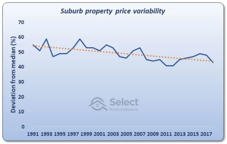
This is clear from the below graph which tracks the price disparity between properties in the same suburb (it covers over 10,00 suburbs over a period of 30 years). If certain properties in a suburb outperform other properties in the same suburb because of their proximity to amenities, then we should see an increasing price disparity over time - or in other words, the yellow dotted line below would be trending upwards because those houses on the good streets would continually outperform the inferior streets; however, as you can see it is trending downwards, meaning that the price gap between properties in the same suburbs gets smaller and smaller over time.
Therefore, in the long term it doesn't matter if your property is close to certain amenities or not. Please see the below video from the Suburb Data podcast which explains this all in more detail.
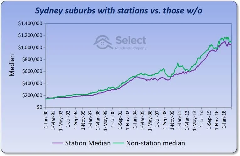
Proximity to train stations
First up we have proximity to train stations and this example is looking at Sydney in particular, as you can see the green line (non-station suburbs) and purple line (station suburbs) have more or less had the same amount of growth in the long-term as the trend lines continuing to meet and converge on each other at certain points in time - suggesting that proximity to a train station doesn't impact long-term growth.
*Note: I haven't included it here, but one exception to this data / trend may be in Melbourne - check out this link to the full research for more information: https://selectresidentialproperty.com.au/school-shops-overrated/
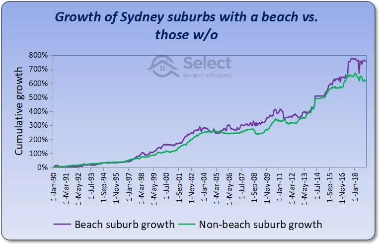
Proximity to the beach
This one may be a surprise for the beach lovers out there, but proximity to a beach also does not have an impact on long-term capital growth. I sound like a broken record at this point, but this is clear from the graph on the right (which uses Sydney as the data source) where you can see that the green line (non-beach suburb) and purple line (beach suburb) continue to meet and converge on each other. Yes, at the end of the graph it looks like there is a decent gap between the two, but this is just because it ends in 2018 and given the amount of 'touch points' in the graph (i.e. times where the lines overlap) there is a very very strong statistical likelihood that the non-beach suburbs will (or already have…) catch-up with the beach suburbs in the future as they have done for the prior 20+ years.
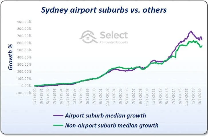
Proximity to the airport
The same thing goes for proximity to airports - based on this graph (using Sydney as the data source) it has no impact on long-term capital growth. Again, I am repeating myself, but yes there is a small gap at the end of this graph between airport suburbs and non-airport suburbs but given the amount of times the lines have overlapped each other there is a very very strong statistical likelihood that the non-airport suburbs will / have already caught-up to those airport suburbs.
In case you are still not convinced, let's take a look at a few examples from some more research by Jeremy Sheppard (noting the YouTube video I think is technically more up to date but these graphs are still accurate and useful).
Proximity to good schools
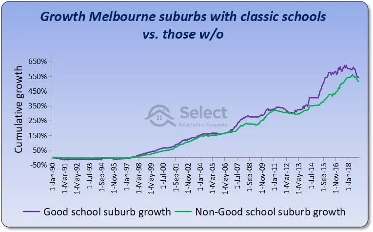
It is a similar story with buying close to traditionally 'good schools', as you can see from the graph on the left (which uses Melbourne as the data source) over the long-term those suburbs with good schools perform the same as those with non-good schools. This is clear from the fact that the green line (non-good school) and purple line (good school) continue to meet and converge on each other over time - suggesting that proximity to good schools doesn't impact long-term growth.
Proximity to shopping centres
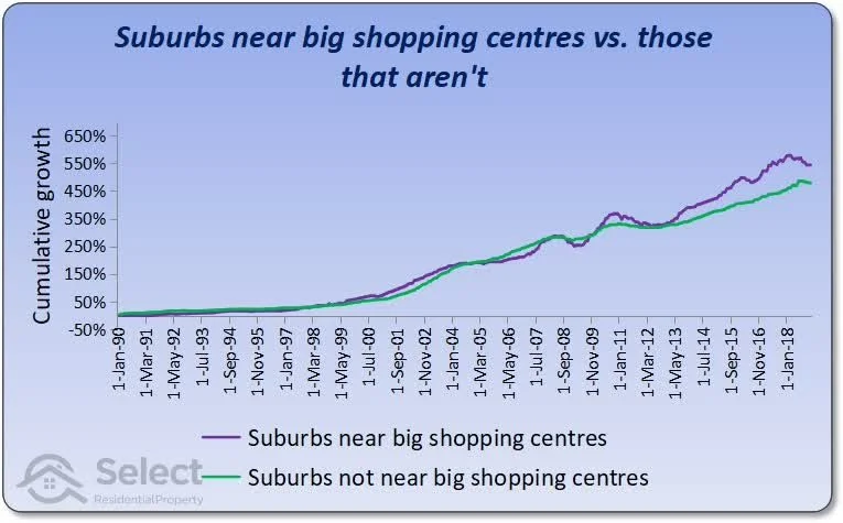
Ok I am going to start speeding through these a bit quicker now, because the trends lines are all very similar to the ones above - this graph looks at suburbs near big shopping centres (think Westfield etc.) and shows that proximity to these type of amenities does not have an impact on long term growth. Similar to the beach suburbs graph above, there is a small gap at the end of the graph between suburbs near big shopping centres (in purple) and those which aren't (in green) but given the amount of times the lines have overlapped each other there is a very very strong statistical likelihood that the non-shopping centre suburbs will / have already caught-up to those suburbs near big shopping centres because they have done so for the previous 20+ years.
Walkability of a suburb
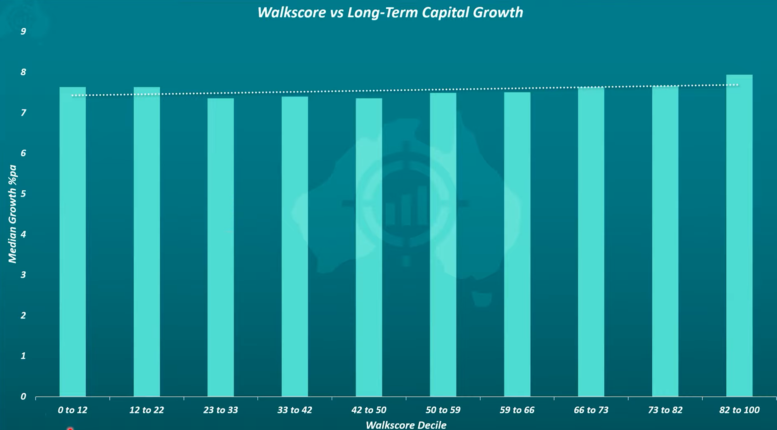
Another common misconception is that those suburbs which are 'walking distance' to all amenities are the best performing suburbs, however, that is not the case. For those of you not familiar with Walk Score, it’s measures the level of walkability to the most popular amenities in a suburb (think parks, stations, beaches, shops etc.). As per the graph, 100 is the best Walkscore and 0 is the worst.
As you can see, the median growth % over the long-term is not significantly impacted by the Walkscore as the line of best fit (i.e. the dotted line) essentially goes straight across. Noting this graph just covers Sydney and Melbourne.
Answer:
This is a MYTH, if a market has above average historical growth then this is actually an indicator that it will likely experience below average growth in the future.
Or in other words, if a market has grown a lot in the past 3, 5, 7 or 10 years - it is actually a red flag.
Explanation:
This is one of my favourite myths to de-bunk as it is one that is constantly thrown around by so-called property experts (e.g. Jack Henderson…).
The misguided theory behind this myth is that there is something inherently special about an area which explains why it’s had such high historical growth, it may be that it is a blue-chip suburb or close to great amenities like the beach, and it is for this special reason that the area will continue to deliver above average growth in the future.
Whilst this may seem logical at the first, the data does not support this theory.
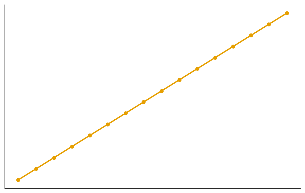
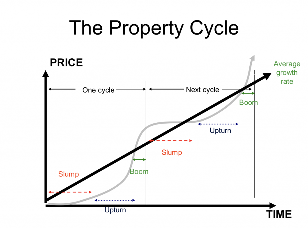
As you know, property markets operate in cycles and due to the concept of 'mean reversion' all areas go through periods of outperformance and underperformance (go read Step 1 where I explain this in more detail if you haven't already). Or in other words, property markets don't grow in a linear way like the yellow line below…… instead it is much more irregular and looks similiar to the grey line below:
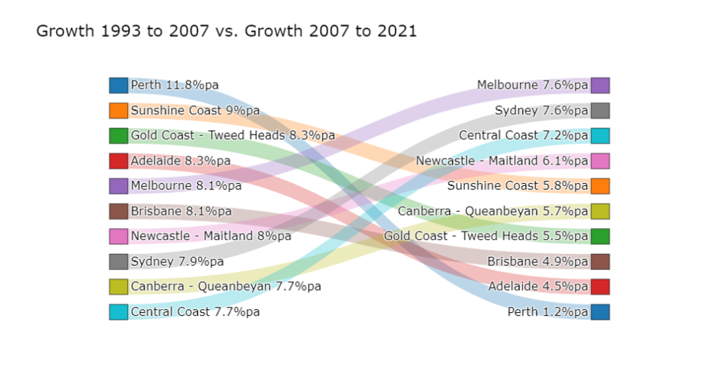
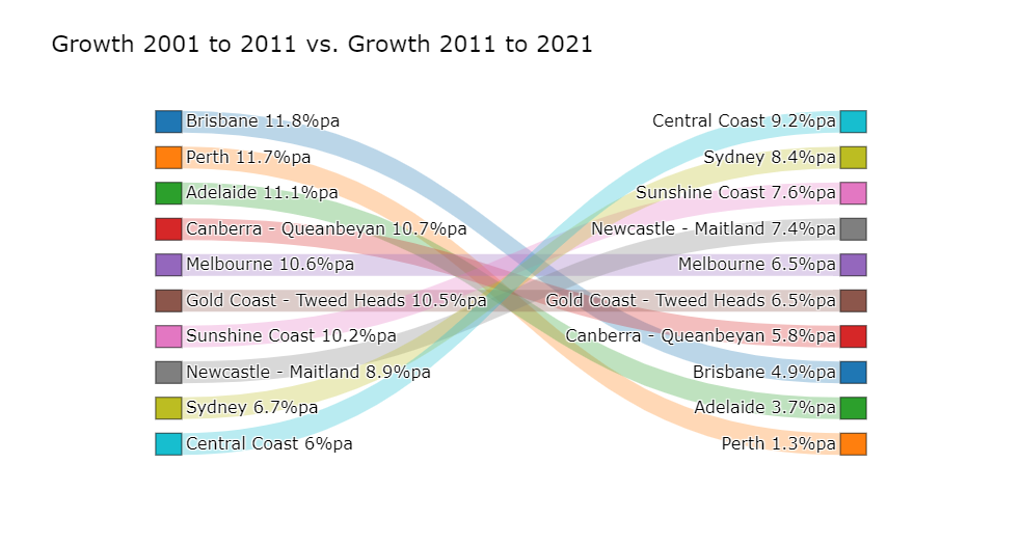
If that graph isn't clear enough, take a look at the below graph which looks at the specific performance of Australia's largest significant urban areas in the decade from 2001 to 2011 then compares it with their performance over the next decade in 2011 to 2021. As you can see, there is a clear pattern of those areas which performed very well in the first decade (e.g. Brisbane, Perth and Adelaide) being the worst-performers in the next decade (and vice versa).
For the smart students in the class, you will notice that this graph only goes up to 2021 and which markets have now been the best performers since 2021? That's right… Brisbane, Perth and Adelaide.
This doesn't mean you should just go buy in the worst-performing suburb in Australia over the past decade, because if a market has only grown 1% in 10 years for example then there may be something fundamentally wrong with it, perhaps from an economic diversity perspective, and most importantly markets don't just grow purely because they haven't grown for a long time - there needs to be more demand than supply (as we have discussed…) in order to spark this growth.
However, what it does tell you is that if you are looking at an area and it has: (1) strong supply / demand factors; and (2) it has underperformed over the past few years - then you may be on to a winner that is going to provide you strong-capital growth in the years to come.
If the above is still unclear to you, feel free to check out this episode from the Suburb Data podcast which explains it really well with some new / updated graphs.