Step 1 - Understanding the Fundamentals
Learning how to invest in specific markets at specific times is arguably the most important skill in property investing.
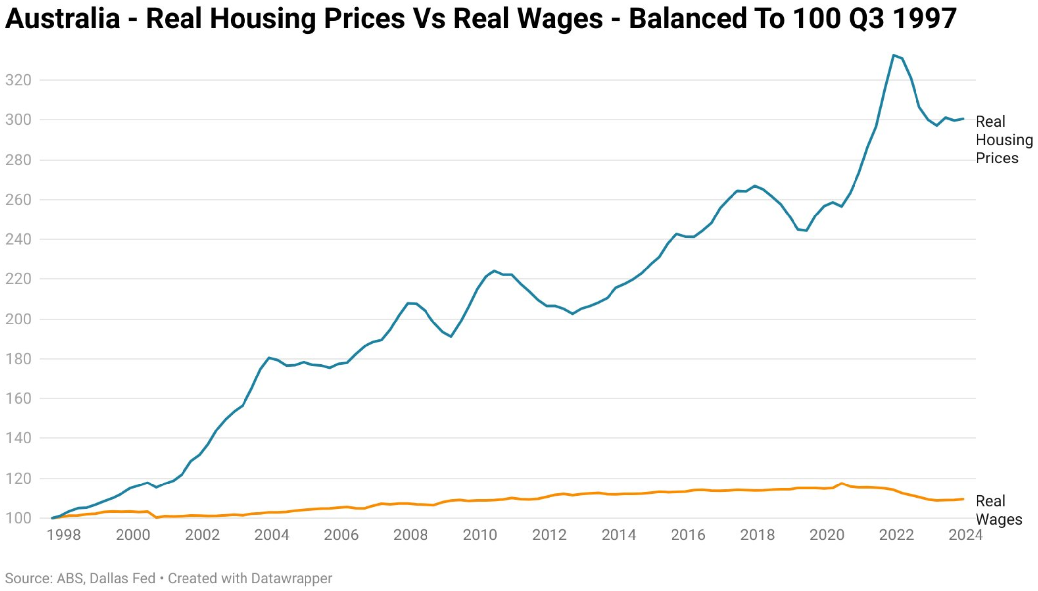
I have mentioned this before, but the reason for this is because for the average Australian (i.e. not a wealthy business owner or law firm partner) to build a sizeable property portfolio, you cannot wait 5+ years for any significant price growth - you need short and medium term growth so that you can use the equity you have gained from that property to fund the deposit for your future purchases. If not, you will be relying solely on your cash savings to get you into your next investment property which is basically like running on a treadmill backwards given that real house prices increase astronomically faster than real wages (see the below graph for reference), meaning that by the time you have saved for your next deposit property prices have likely already increased by a greater amount than your savings.
This means it is crucial that you time your entry into the market so that you are investing at a time in the property cycle which is most likely to get you capital growth sooner rather than later. Now don't focus too much on 'how' to do this just yet (we will get to that in Step 4) - you first need to understand 'what' the property cycle is.
What is the ‘Property Cycle’?
The property cycle is the general pattern of increases and decreases in house prices over time which can be broken down into various stages, depending on how technical you want to get; however, in alignment with the ethos of this website I am going to keep it very simple and describe it in three stages:
Phases of the Property Cycle (simplified)
Phase 1 - Boom: This phase is categorized by rapid price growth over a short period of time due to very high demand and low supply which results in properties often selling very quickly and well above the asking price. This is where 'FOMO' is at its peak and generally when an area will start to get some media attention.
Phase 2 - Slump (or Stagnation): Following the peak of the 'Boom' phase, price growth begins to gradually decrease and / or stagnate over a longer period of time as demand begins to taper off and buyers become more cautious. This could be for a variety of reasons - such as prices reaching a level which is now unaffordable for the local demographic. Ultimately, this results in the supply levels catching up to, or outweighing, the level of demand.
The diagram on the right reflects a 'Slump' phase which has resulted in prices stagnating or decreasing slightly; however, please note that depending on the supply / demand levels and other economic factors this 'Slump' phase can also be the phase where prices drop quite noticeably over time (this generally doesn't occur overnight in the property market!).
Phase 3 - Upturn (or Recovery): After the 'Slump' phase (which could go on for a very long period of time - even 10+ years in some areas), supply levels begin to decrease and demand starts to gradually increase. As discussed, this could be for a variety of reasons - i.e. the area may be affordable now. As a result, property prices begin to gradually increase over time and the foundation for the next 'Boom' phase is laid. This can mark the start of a sustained period of growth for the area.
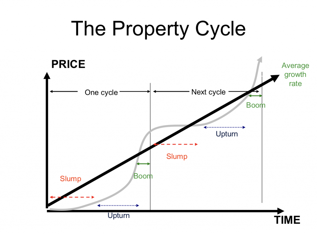
Hopefully it is obvious from the curvature of the grey line in the above diagram, but it is crucial for you to remember that the transition between these cycles is not instant - it occurs gradually.
For example, an area will not go from a 'Boom' phase growing 20% per annum to a 'Slump' phase in the course of a few months - it generally takes a few years, where the growth rate will continue to decline but prices are technically still growing - just not at the rate it was in previous years (i.e. one year it may grow 10%, then the next 7%, followed by 5% until prices eventually stagnate or even decline).
In case that still doesn't make sense, let me explain the phases of the property cycle again but using boiling water in a kettle as an analogy:
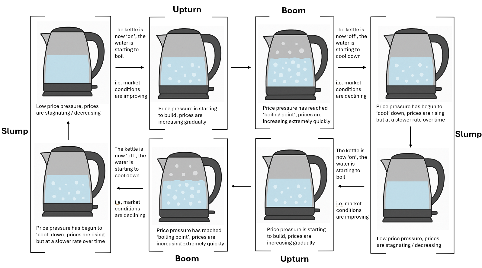
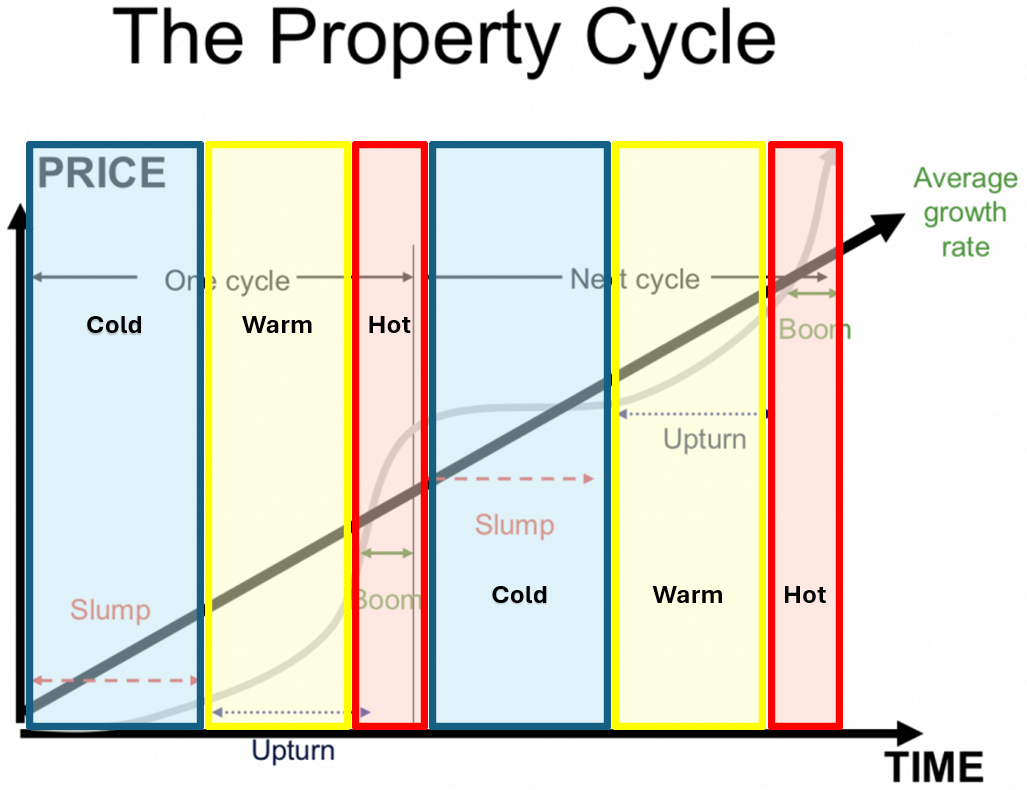
People use many different terms and phrases to explain the above cycle, but they more or less will reflect the above. Just for your reference, another popular way of describing property cycles is by reference to temperature - i.e. "hot market" (or hotspot), "warm market" and "cold market". These are basically just another way of describing a "boom", "upturn" or "slump" phase.
Hot market = boom phase
Warm market = upturn phase
Cold market = slump phase
It is important to remember that there are over 15,000 suburbs in Australia, and each one of them is in a different stage of their property cycle. However, generally you will find that there are clusters of suburbs in close proximity of each other or even a whole region / city that is entering similar stages of the property cycle at a similar time. The key is identifying those suburbs / areas which are in or entering the most optimal buying window in the property cycle.
Ok, so when is this 'optimal' buying window?
Well, that will depend on your goals, namely how quickly you need equity, but generally speaking the optimal time to invest in an area is when it is at the start of the 'Upturn' phase or near the end of the 'Slump' phase - this way you get the benefit of the entire growth cycle in an area with limited initial stagnation and you will also have significantly less competition from other buyers so it will ultimately be easier to purchase an investment grade property.
However, property investing is not an 'exact' science, so if you enter a bit earlier in the 'Slump' phase or at any time in the 'Upturn' phase - i.e. a 'good' buying window - then that is perfectly fine and certainly not the end of the world (quite the contrary!). See the below diagram for a visual representation of these buying windows.
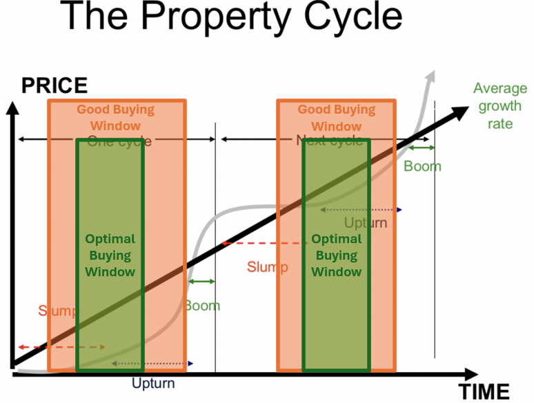
Ultimately, what we want to avoid is buying too early in the 'Slump' phase which results in us waiting too long for equity growth, but we will also want to avoid buying too far into the 'Boom' phase as the competition will be intense which means our purchase price on entry will be higher and we would have missed out on some good growth in the 'Upturn' phase.
This is where the majority of property investors get it wrong - they hear from a friend, Facebook group or the media that an area is a 'hotspot' and has doubled in value the past 5 years, then they get FOMO and invest in that area thinking their property will do the same.
However, in reality they have just invested at / or past the peak of the 'Boom' phase, they get a bit of growth over the next year or so then get stuck in the 'Slump' phase for years (all whilst paying holding costs).
One reason why I believe people keep making this mistake is because they don't understand the concept of mean reversion.
Understanding mean reversion
Mean reversion is a financial theory which states that over time property prices in an area tend to revert back to their long-term averages. The practical implications of this theory in the property market are as follows:
Periods of overperformance: If property prices in an area have been over-performing the long-term average growth rate for the past decade*, then there is a stronger likelihood that they will under-perform the long-term average growth rate in the next decade* as it begins to revert back to its long-term average price (i.e. what the prices would have been if it grew at its long-term average growth rate each year, with no under or over performance in this time).
Periods of underperformance: If property prices in an area have been under-performing the long-term average growth rate for the past decade*, then there is a stronger likelihood that it will over-perform the long-term average growth rate in the next decade* as it begins to revert back to its long-term average price (i.e. what the prices would have been if it grew at its long-term average growth rate each year, with no under or over performance in this time).
*Note: I have used a decade as the time period here just by way of example - these periods of underperformance and overperformance can be far shorter or longer than a decade depending on the market conditions of the specific area.
What are the implications of this? Well it means that if an area has been experiencing a period of underperformance in recent history then this is actually a positive sign that you should do some deeper research into the suburb.
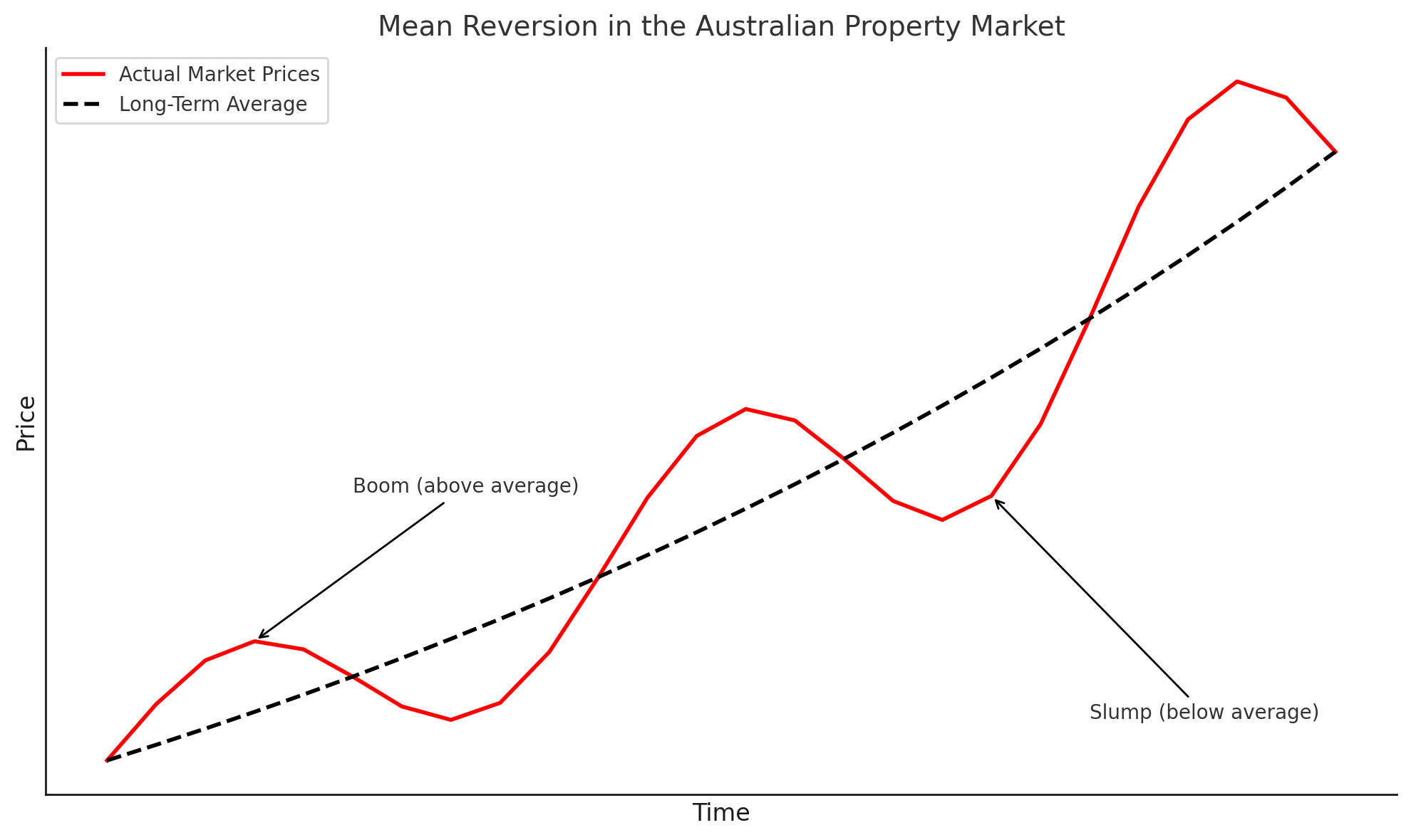
I appreciate that this is generally the opposite way that the average investor thinks and that this might not make too much sense as just a chunk of text, so take a look at the below graph which my trusty Chat GPT created for me (it's very oversimplified but should do the trick).
As you can hopefully see, each time that prices (in red) go beyond the long-term average (the dotted black line) during a 'Boom' phase - i.e. a period of overperformance, the prices then begin to decrease over time so they are then below the long-term average - i.e. a period of underperformance, this cycle then continues in a similar fashion over time. Now depending on the market conditions of the specific area you are investing in, these periods of underperformance in particular may not be as pronounced - i.e. so instead of steep price decreases they may be longer periods of price stagnation.
Pop quiz: When looking at the very end of this graph, what do you think is most likely* to happen to prices (i.e. the red line):
(a) the price / red line will continue to decrease below the long term average; or
(b) the price / red line will start to increase above the long term average.
Answer: The answer is (a), prices have overperformed recently and as a result it will likely* continue to decline and underperform the long term average growth rate. Or in other words, investing at this time would actually be a bad investment - despite all the very strong recent growth.
*Note: You will see me using 'likely' a lot in this section - that is because ultimately this is all theory (a well-established one though!) and there are no certainties in property investing, only ways to reduce uncertainty as much as possible.
Now please note that just because an area has underperformed its long-term average recently it doesn't mean it will just automatically revert back to the mean in the next few years. The market conditions in the area need to become favourable again so that it can spark a reversion back to (and beyond) its long-term average, otherwise nothing will change and prices won't move positively - this spark can come in various forms, such as improving economic conditions (e.g. declining unemployment rate, increasing GDP, influx of internal / overseas migration, improved affordability etc.) and, our favourite, decreasing supply and increasing demand.
Therefore, whilst understanding mean reversion can help us identify which markets are undervalued or overvalued based on historical averages, we ultimately still need to analyse the long-term and short-term supply / demand trends in an area to more accurately assess where an area is in its property cycle and time our entry accordingly.
Wait…you can time the market?
Now if you are reading this and have started to think - this guy is full of sh*t, you shouldn’t try and time the market, doesn't he know the saying that "time in the market beats timing the market".
Whilst I am sympathetic to the message behind this quote (as there is a lot of truth to it), what frustrates me is how this quote is religiously misinterpreted / used out of context in property investing spaces with most people (or buyers agents) just using this to justify the initial underperformance of their investment property purchases in the short to mid-term. Or to convince you to only buy in the 'blue chip' areas that they service, because that is what is the easiest for them…
With that being said, let's put this quote into context - this quote was first made with reference to the stock market and, generally speaking, is aimed at dissuading the everyday person from 'day trading' / 'stock picking' and encouraging them to dollar cost average (i.e. consistently invest whatever they can afford) into: (1) index funds, such as the S&P 500 which gives them broad exposure to 500 leading companies in the US; and / or (2) blue-chip stocks such as CommBank or BHP.
I won't comment again on the age-old debate of 'Property vs Shares' as we talked about that earlier but what I will say is that the property market and the stock market are completely different. There are plenty of differentiating factors between the two but let me highlight the most important for this conversation:
Property is an illiquid asset, whilst stocks are a liquid asset. Or in other words, property is much more time consuming, expensive and generally more difficult to sell / purchase than shares. For anyone with experience with selling / buying property you will understand this all too well - there are inspections, negotiations, legal documents, mortgage approvals, settlement periods (30 - 90 days) and the transaction costs in Australia are very high (generally 7% of the purchase price). Whereas if I wanted to sell / purchase shares I could do it almost instantly at the click of a button on a brokerage app all from my phone.
Ultimately this means that property exchanges hands at a significantly lower rate than stocks. For context, there are approximately 2.13 million trades per day on the stock markets in Australia; whereas there are only 1,915 property settlements per day - this is also just on a national level, when you break it down by city it gets even smaller with Sydney (Australia's largest city) having only have 280 settlements per day. Now imagine if we broke this down even further to a suburb level…
So why is this difference so important?
Because the illiquidity of the property market (combined with a few other things, such as information asymmetry) means that it is a very inefficient market and therefore does not react as quickly as the stock market. This therefore makes the long-term and short-term trends in property data, especially on a suburb level, more reliable which ultimately increases the probability for you to be able to enter a specific market at a specific time that is primed for capital growth.
I know have teased this a lot, but I will go into the specifics of how we can do this in Step 4 - this current step is all about building your knowledge base so you understand why and what we are doing here; however, just to illustrate the point let’s take a look at the below graph again which I shared in the prior lession regarding demand vs supply.
Specifically, this graph maps the stock on market % in blue (i.e. the supply of houses) and days on market in red (i.e. the demand for houses) against the median house prices in the suburb in green, which in this case is Kelso QLD.
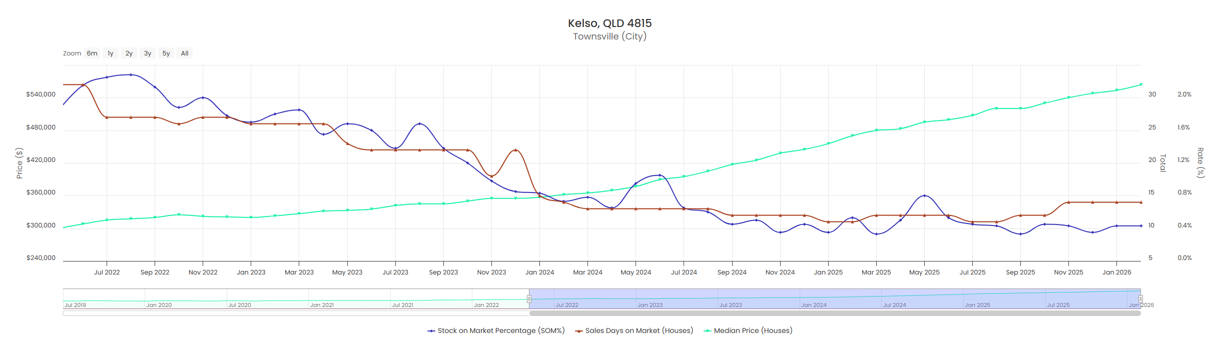
In particular, I want you to take a look at the blue and red lines which are tracking the supply and demand of the suburb, you see how they are just gradually trending downwards over time between September 2022 to September 2024 and there are no massive jumps in the data over the course of 2 years - yes sure there are small deviations (i.e. maybe one month the SOM% is 1.4% then it is 1.6%) but the trend lines don’t jump all the way to the top of the graph and then in the months after drop all the way to the bottom and so on.
This is even more evident if you look at the data from September 2024 to January 2026 where the data has basically remained flat that entire time.
You can see a clear downward trend in the supply / demand data that has been consistent over the long-term and short-term.
For reference, I purchased a property in Kelso in November 2023 and you can see based on the green line what has happened to prices since… so I can assure you that consistently timing your entry into a market is absolutely possible, you just need to follow the data.